The Figma beginner guide tutorial can look surprisingly simple when you first open it. A few panels, a blank canvas, familiar shapes—and then suddenly, you’re staring at dozens of tools, settings, and features, wondering where to begin.
That’s where most beginners make their first mistake: trying to learn everything at once.
A better approach is to understand what to learn first, what to learn next, and why each skill matters.
This Figma Beginner Guide Tutorial takes you through that journey step by step. You’ll start with the Figma workspace and essential tools, then move into UI design, guidelines, Auto Layout, components, responsive design, wireframing, prototyping, motion, and newer workflows such as Figma Make.
Along the way, you’ll also discover how these skills connect to real UI/UX projects, design systems, collaboration, and portfolio building.
By the end, you won’t just know more Figma features—you’ll understand how to use Figma as a UI/UX designer.
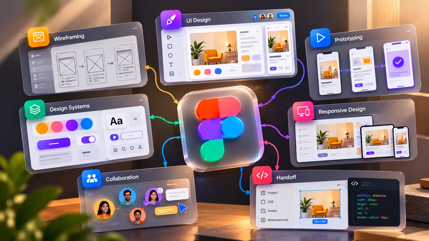
What Is Figma?
Before learning individual tools, it is important to understand what Figma actually does and why it has become such an important part of the UI/UX design workflow.
At its simplest, Figma is a collaborative design and prototyping platform used to create digital interfaces such as websites, mobile apps, dashboards, and other interactive products.
But thinking of Figma as “just a design tool” can make the learning process confusing.
The Figma beginner guide tutorial can support several stages of a UI/UX project:
- Wireframing: Plan the structure and layout before focusing on visual details.
- UI design: Turn rough ideas into polished screens using typography, colour, spacing, imagery, and components.
- Prototyping: Connect screens and interactions to demonstrate how a product should behave.
- Design systems: Create reusable components, styles, variables, and patterns for consistency.
- Responsive design: Explore how layouts can adapt to different screen sizes.
- Collaboration: Designers, developers, product teams, and stakeholders can work around the same design files.
- Handoff: Developers can inspect designs and access the specifications and assets needed for implementation.
This is why learning the Figma beginner guide tutorial isn’t simply about memorising where every button is.
The more useful question is:
Which Figma skills do you actually need at each stage of a UI/UX project?
A beginner doesn’t need to master advanced variables, complex prototypes, or every available feature on day one.
Start with the workspace and fundamental tools. Then gradually build the skills that allow you to create, organise, refine, and present real interfaces.
That order makes Figma easier to understand—and much easier to apply.
What to Learn First
Now that you understand what Figma can do, the next question is more practical: where should you actually begin?
Opening the Figma beginner guide tutorial and immediately exploring every feature can make the tool feel more complicated than it is. A better approach is to build your skills in layers, starting with the fundamentals that you will use repeatedly.
Think of your learning path like this:
- Start with the workspace: Understand the canvas, toolbar, layers panel, properties panel, pages, frames, and basic navigation.
- Learn the essential tools: Get comfortable with frames, shapes, text, images, pen tools, and basic selection and alignment.
- Understand visual foundations: Learn spacing, typography, colour, grids, alignment, and hierarchy before trying to create polished interfaces.
- Create simple screens: Apply those fundamentals by designing a basic website or mobile screen instead of practising tools in isolation.
- Move into Auto Layout: Once you understand basic positioning, learn how elements can respond to their content and work together more efficiently.
- Learn components: Start creating reusable buttons, cards, navigation elements, and other interface patterns.
- Add interaction: Move into prototyping once your static screens are comfortable.
- Explore advanced workflows later: Variables, design systems, motion, collaboration, and Figma Make become easier to understand once the fundamentals are in place.
This sequence matters because each skill builds on the previous one. Learn the foundation of the Figma beginner guide tutorial first, then add complexity when your designs actually need it.
That approach keeps your Figma learning practical, focused, and connected to real UI/UX work.
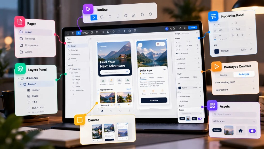
Figma Workspace
Once you know what you want to learn first, it is time to get comfortable with the place where most of that learning will happen: the Figma workspace.
You do not need to memorise every panel or setting before creating your first design. Start by understanding the areas you will use repeatedly:
- Toolbar: Your starting point for selecting, creating frames, adding shapes, inserting text, drawing, and accessing other essential tools.
- Canvas: The main working area where your frames, wireframes, UI screens, and prototypes come together.
- Layers panel: Helps you see and organise everything inside your design. Clear layer names become increasingly important as projects grow.
- Properties panel: Use this area to adjust dimensions, position, spacing, colours, typography, effects, and other properties of selected elements.
- Pages: Keep different parts of a project organised instead of placing everything on one endless canvas.
- Assets: Access reusable components and other design resources as your projects become more structured.
- Prototype and Design controls: These allow you to move from creating static screens to defining interactions and behaviour.
At first, the workspace may feel like a lot of information. That is normal.
Instead of learning each area separately, learn it while designing. Create a simple frame, add a few elements, change their properties, organise the layers, and observe how each part of the workspace responds.
This hands-on approach for the Figma beginner guide tutorial becomes more valuable as you move into real projects. UI UX Growth Lab also follows a practical learning approach built around designing, reviewing, iterating, and improving rather than simply watching tutorials.
Once the workspace feels familiar, you are ready for the next step: learning the Figma tools you will actually use to build your first interface.
Figma Tools
Now that you know your way around the workspace, it is time to understand the tools that will help you turn a blank frame into an interface.
The important thing here is not to learn every Figma feature at once. Start with the tools you will repeatedly use while creating real UI/UX designs.
Start with these essential tools
- Move and Select: Select, move, resize, and arrange elements on the canvas. These simple actions form the foundation of almost every Figma workflow.
- Frame: Create screens, sections, and structured layouts for websites, mobile apps, and other digital products.
- Shape tools: Use rectangles, lines, ellipses, polygons, and other basic shapes to build interface elements.
- Text: Create headings, labels, buttons, navigation items, and other content. Typography will become increasingly important as you refine your visual hierarchy.
- Pen: Draw custom vector paths and shapes when standard shapes are not enough.
- Image: Add and position photographs, illustrations, icons, and other visual assets within your designs.
- Alignment and distribution: Position elements consistently and maintain predictable spacing throughout a layout.
- Fill and Stroke: Control colours, borders, and other basic visual properties.
- Effects: Add shadows, blur, and other visual treatments when they support the interface.
- Boolean operations: Combine or subtract shapes to create more complex graphics.
A useful way to learn these tools is to use them together rather than practising them in isolation.
For example:
Frame → Shape → Text → Image → Align → Style
With just this sequence, you can already create a basic interface screen.
As you progress, tools such as Auto Layout, Components, Variables, and prototyping features will become increasingly important. However, they should come after you understand the fundamentals because their value becomes much clearer when you are solving an actual design problem.
This is also why practical projects matter. UI UX Growth Lab’s article on learning Figma through five real projects explores how the learning curve changes as you move from simple screens to more advanced interfaces.
And remember: Figma is the tool, not the design process. Your goal is to understand why you are using a tool and what problem it helps you solve.
Once these essentials become comfortable, you can start using them to create something meaningful: your first UI design.
Your First UI Design
You have explored the workspace and learned the essential tools. Now it is time to stop practising them individually and use them to create something real.
Your first UI design does not need to be complex. A simple screen is often more useful because it allows you to focus on the fundamentals without getting distracted by advanced features.
Start with something familiar:
- A simple landing page
- A mobile login screen
- A restaurant app screen
- A course website
- A travel booking page
- A personal portfolio homepage
Focus on the fundamentals
Before adding advanced effects or decorative elements, concentrate on the decisions that make an interface easier to understand:
- Layout: Decide where the major sections and elements should be positioned.
- Hierarchy: Make the most important information immediately noticeable.
- Typography: Create a clear distinction between headings, supporting text, and labels.
- Colour: Begin with a small, intentional colour palette.
- Spacing: Give elements enough breathing room to prevent the interface from feeling crowded.
- Alignment: Keep related elements visually connected through consistent positioning.
- Consistency: Use similar visual treatments for elements that serve similar purposes.
These fundamentals will become the foundation for your Figma guidelines as your designs become more detailed.
Try creating one complete screen without following every step of a tutorial. Use the tools you have learned, make your own design decisions, and then review the result.
Ask yourself:
- Is the most important information easy to find?
- Does the layout feel balanced?
- Are related elements grouped together?
- Is the typography easy to scan?
- Does anything feel unnecessarily complicated?
This is where a Figma beginner guide tutorial becomes more than a list of features. You are beginning to understand how individual tools work together to solve a design problem.
The real purpose of a Figma beginner guide tutorial is not to help you reproduce someone else’s screen. It is to help you develop the confidence to make your own design decisions and understand why they work.
The goal is not to create a perfect interface on your first attempt. It is to develop the habit of making a design decision, reviewing the result, and improving it.
Once your first interface is taking shape, the next step is to establish the visual rules that keep your design clear, balanced, and consistent.
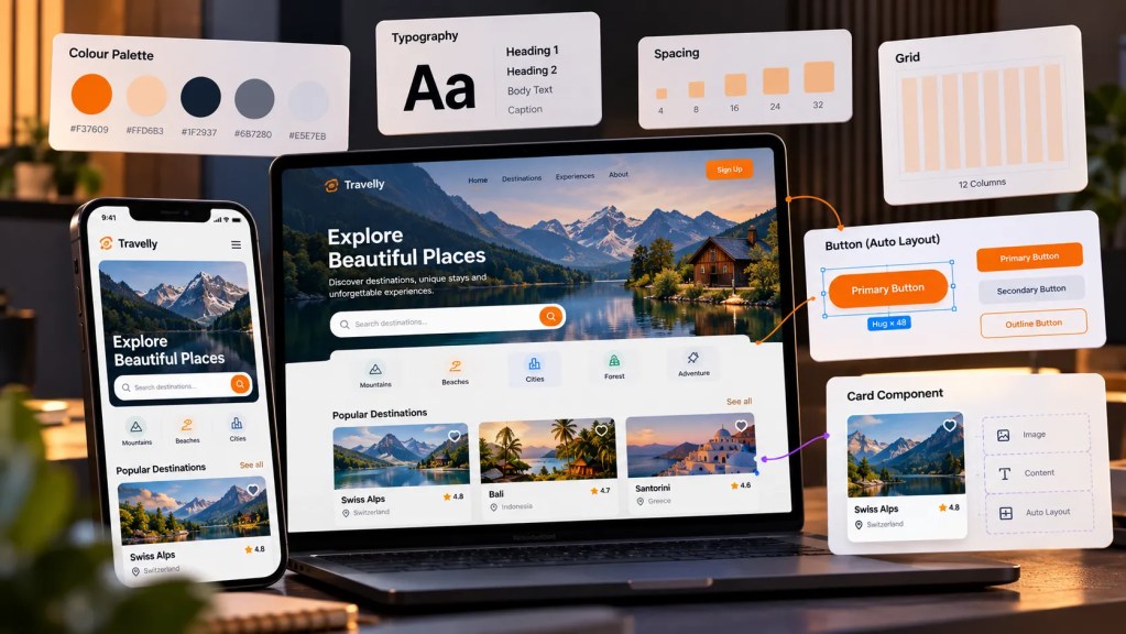
Guidelines
Your first interface is on the canvas. Now comes the part that separates a collection of elements from a clear, usable interface: establishing visual rules and applying them consistently.
Think of figma guidelines as a set of decisions that help your design stay organised as it grows.
Start with a few fundamentals:
- Spacing: Use consistent gaps between related and unrelated elements instead of positioning everything by eye.
- Typography: Establish a clear hierarchy for headings, body text, labels, and supporting information.
- Colour: Define a limited palette and use each colour with a clear purpose.
- Grid: Use columns, margins, and alignment to create structure across the screen.
- Contrast: Make important content distinguishable without relying only on size or colour.
- Consistency: Similar elements should look and behave similarly throughout the interface.
- Hierarchy: Guide attention by deciding what users should notice first, second, and third.
The goal is not to make your first screen perfect. It is to make your decisions intentional and repeatable.
As you continue through this Figma beginner guide tutorial, these figma guidelines will become the foundation for more advanced skills such as Auto Layout, components, responsive design, and design systems.
There is also an important distinction to remember: visual guidelines do not replace UX thinking. A beautifully aligned interface can still create problems if the underlying user flow does not make sense.
UI UX Growth Lab’s article on learning UI/UX design from scratch by thinking like a user explores this distinction and explains why Figma should support your design thinking rather than become the starting point for every decision.
When you eventually explore AI-assisted workflows through figma make tutorials, these fundamentals become even more valuable. Generated layouts still need to be reviewed against hierarchy, spacing, consistency, and the actual design problem.
With these principles in place, your next step is to make your layouts adaptable rather than manually positioned. That is where Auto Layout comes in.
Auto Layout
Your first screen may look fine when everything is placed exactly where you want it. But what happens when the text becomes longer, a button label changes, or another element needs to be added?
This is where Auto Layout becomes an important step in your Figma learning journey.
Instead of manually positioning every element, Auto Layout allows you to define relationships between elements so that layouts can respond to changes in content and structure.
Start with the basics
- Horizontal layouts: Arrange elements from left to right, such as navigation items or button content.
- Vertical layouts: Stack elements from top to bottom, such as cards, forms, or content sections.
- Spacing: Define consistent gaps between elements instead of adjusting each position manually.
- Padding: Control the space between content and the boundaries of a frame.
- Resizing: Allow elements to grow, shrink, or adapt based on their content and available space.
- Nested layouts: Combine multiple Auto Layout frames to create more flexible interface structures.
A simple example makes the difference clear:
Static button: Change the label → manually resize the button.
Auto Layout button: Change the label → the button adapts to the content.
That shift is important because you are no longer thinking only about where an element sits. You are thinking about how elements relate to one another.
This is why Auto Layout should not be treated as just another feature in a Figma tool tutorial. It changes the way you construct interfaces and prepares you for responsive design, reusable components, and more complex layouts.
A practical way to learn it is to rebuild familiar elements:
- Create a button that expands with its text.
- Build a card that grows when more content is added.
- Create a navigation bar with consistent spacing.
- Build a simple form using vertical Auto Layout.
You can then gradually combine these patterns into complete screens. Figma learning resources from UI UX Growth Lab also emphasise moving from basic interfaces toward responsive layouts and reusable structures through practical work.
As you progress through this Figma beginner guide tutorial, Auto Layout will become one of the foundations for building interfaces that are easier to edit and adapt.
And when exploring figma make tutorials later, understanding these layout relationships will help you evaluate generated designs instead of simply accepting the first output.
Next, we can take this one step further: reusing the elements you have already designed through Components.
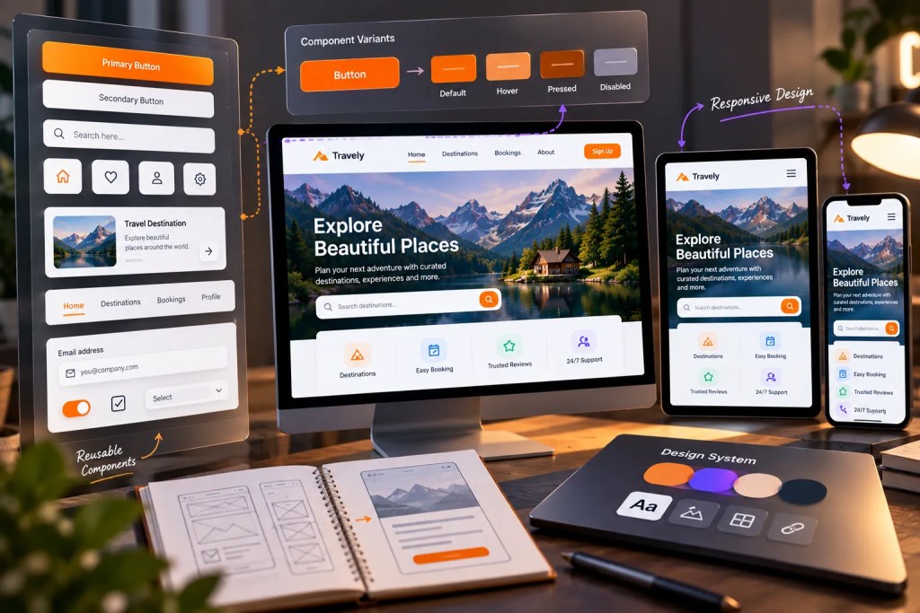
Components
Once Auto Layout starts making your interface easier to structure, the next question is simple: why should you design the same element again and again?
This is where Components become useful.
A Component is a reusable design element that can be used across different parts of a project. Instead of creating every button, input field, card, or navigation element from scratch, you can create it once and reuse it wherever needed.
Start with familiar interface elements
- Buttons: Create a primary button once and reuse it across multiple screens.
- Input fields: Maintain consistent styling across forms and search interfaces.
- Cards: Reuse the same structure for products, articles, courses, or other content.
- Navigation: Keep menus and navigation patterns consistent throughout a product.
- Icons and controls: Reuse common interface elements instead of recreating them repeatedly.
Components become even more useful when combined with Variants, allowing related versions of an element to exist within the same reusable structure.
For example, a button could have:
Default → Hover → Pressed → Disabled
This creates a more organised workflow and makes future changes easier.
A good Figma tool tutorial can show you where to create a Component, but understanding why you should create one is more important. The purpose is not simply to learn another feature; it is to build interfaces that remain consistent as they grow.
Your figma guidelines also become easier to maintain because reusable elements can preserve typography, spacing, colour, and other visual decisions across screens.
As you continue through this Figma beginner guide tutorial, think of Components as a bridge between individual screen design and larger interface systems.
And there is another advantage: when you update a well-structured Component, related instances can reflect those changes without requiring you to rebuild each element manually.
That is why Components matter beyond a basic Figma tool tutorial. They help you move from designing individual screens toward creating consistent, scalable interfaces.
The next challenge is making those interfaces work across different screen sizes. That leads naturally to responsive design.
Responsive Design
Your interface may look perfect on one screen size, but real products rarely live on a single screen. Websites and applications need to work across different devices, resolutions, and available spaces.
That is where responsive design becomes important.
In this stage of your Figma beginner guide tutorial, start thinking beyond fixed positions and ask how your interface should respond when the available space changes.
Focus on:
- Flexible layouts: Use Auto Layout and appropriate constraints instead of relying entirely on fixed positioning.
- Spacing: Maintain meaningful relationships between elements as the screen size changes.
- Typography: Make sure text remains readable without overwhelming smaller screens.
- Content priority: Decide what should remain visible, move, resize, or disappear at different breakpoints.
- Components: Build reusable elements that can adapt instead of creating every version from scratch.
- Consistency: Keep your core visual language intact across different screen sizes.
Your figma guidelines should support these decisions rather than restrict them. A responsive interface is not simply a smaller version of a desktop design; it may require different arrangements and priorities.
At this point, you may also encounter interaction-focused topics such as a figma motion tutorial. Motion can help demonstrate how an interface behaves when elements resize, appear, disappear, or transition between states.
However, learn the layout fundamentals before adding motion. A second figma motion tutorial will not fix a layout that does not respond logically to different screen sizes.
The goal is to make your design adaptable, understandable, and consistent before moving into the next stage: turning rough ideas into polished interfaces through the wireframe-to-UI process.
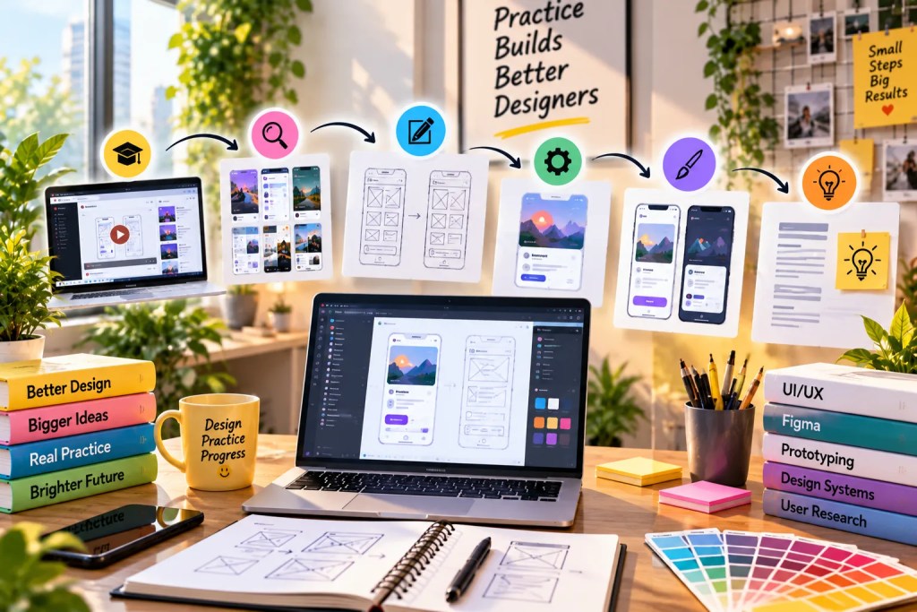
Wireframe → UI
A wireframe gives your interface structure before visual styling takes over. It helps you decide what belongs on the screen, where it should appear, and how users should move through the information.
Think of the transition as:
Structure → Hierarchy → Visual design → Interaction
Start with a simple wireframe:
- Define the main sections of the screen.
- Place navigation and primary actions.
- Organise content according to importance.
- Keep colours and decoration minimal.
- Check whether the layout makes sense before refining its appearance.
Once the structure works, move into the UI stage.
Now you can introduce:
- Typography
- Colour
- Images and icons
- Spacing
- Components
- Visual hierarchy
- Brand elements
Your figma guidelines should remain consistent during this transition. Do not change the structure simply because you are adding visual styling. If the information hierarchy is unclear in the wireframe, adding colour or decoration will rarely solve the underlying problem.
This is also the stage where you begin thinking about interaction. A figma motion tutorial can help you understand how transitions and movement can communicate changes between screens or states.
However, motion should support the experience rather than distract from it. Before following another figma motion tutorial, make sure the static interface already communicates its purpose clearly.
The important lesson is simple: a polished UI should grow from a clear structure, not hide a weak one.
Once your screens are visually complete, the next step is to connect them and demonstrate how the interface behaves. That brings us to prototyping.
Prototyping
Your screens now have structure, visual hierarchy, and reusable elements. But a finished UI still does not show the complete experience. Prototyping connects the screens and gives your design behaviour.
In Figma, a prototype can demonstrate what happens when a user interacts with an interface.
Start with simple interactions:
- Navigation: Connect buttons, menus, and links to the appropriate screens.
- User flows: Create a clear path from one action to the next.
- Overlays: Use menus, dialogs, pop-ups, and similar interface patterns.
- Interactions: Define what happens when users click, tap, hover, or perform another supported action.
- Transitions: Add appropriate movement between states when it improves understanding.
- Scrolling: Demonstrate how longer pages or sections behave.
- Interactive states: Show changes such as selected, expanded, focused, or completed states.
The important part is not adding as many interactions as possible. A prototype should answer a practical question:
What should the user experience when they interact with this interface?
Start with the most important user flow rather than connecting every screen immediately. Test whether the journey feels logical, whether important actions are easy to find, and whether anything creates unnecessary confusion.
This is also where your earlier work begins to come together. Layout, Components, responsive behaviour, and visual hierarchy now have to work as one system.
If a prototype exposes a problem, return to the design and improve it. That feedback loop is an important part of UI/UX work.
Once basic interactions feel clear, you can explore a more expressive layer of interaction: motion and animation in Figma.
Motion
Your prototype explains what happens when a user interacts with the interface. Motion can take that experience a step further by showing how the interface changes.
In Figma, motion can be used to communicate transitions, state changes, hierarchy, and continuity without overwhelming the user.
A practical figma motion tutorial should begin with simple interactions rather than complex animations.
Focus on:
- Transitions: Show how one screen or state changes into another.
- Micro-interactions: Give feedback when users interact with buttons, controls, or other elements.
- Continuity: Help users understand where an element has moved or how a new state relates to the previous one.
- Hierarchy: Use movement to draw attention to important changes without distracting from the main task.
- Timing: Keep animations purposeful and appropriate to the interaction.
- Consistency: Similar interactions should follow similar motion patterns throughout the product.
For beginners, start with familiar examples:
Button state → Menu opening → Card expansion → Screen transition
These small exercises help you understand how motion supports usability instead of becoming decoration.
As you work through another figma motion tutorial, avoid adding animation simply because the feature is available. Ask what the movement communicates and whether the interaction would still be understandable without it.
Motion should support the user’s understanding of the interface, not compete with the content.
Once you are comfortable creating basic interactions and transitions, you can explore newer ways of working with Figma. The next step introduces Figma Make and how AI-assisted workflows can fit into a designer’s process.
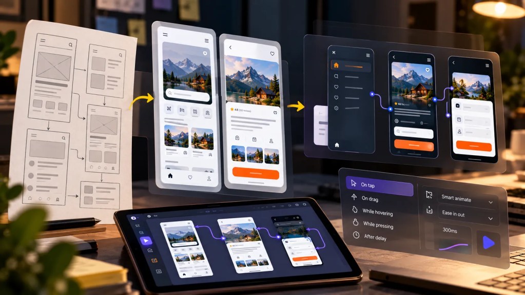
Figma Make
By this point, you have learned how to structure screens, create reusable elements, build responsive layouts, and connect interactions. Now you can explore Figma Make as an additional workflow for turning ideas into functional experiences.
Figma Make uses AI-assisted workflows to help transform prompts and design ideas into interactive prototypes and experiences. For a beginner, the important point is not to treat it as a replacement for understanding design fundamentals.
Start by using figma make tutorials for focused experiments:
- Describe an idea: Explain the interface or experience you want to explore.
- Generate a starting point: Use the output as something to review and develop rather than automatically treating it as the final design.
- Inspect the structure: Look at the layout, hierarchy, content, and interaction choices.
- Refine the result: Adjust anything that does not match the intended user experience.
- Compare alternatives: Try different approaches when exploring an interaction or layout.
- Apply design judgement: Keep decisions that improve the experience and remove those that do not.
This makes figma make tutorials more useful when they are approached as learning exercises rather than shortcuts.
Your earlier Figma skills still matter here. Understanding spacing, typography, components, responsive behaviour, and interaction patterns allows you to evaluate an AI-generated result critically.
The broader lesson is important: AI can accelerate exploration, but design judgement still determines what should be built.
As your projects become more complex, you will need a way to keep repeated styles and components organised. That leads naturally to the next stage: Variables and design systems.
Variables and Design Systems
As your project grows, you will notice a new problem: consistency becomes harder to maintain manually.
A small project may have a few colours, text styles, buttons, and components. A larger product can have hundreds of repeated decisions. This is where Variables and design systems become valuable.
Start by understanding the role of each:
- Variables: Store reusable values such as colours, spacing, dimensions, or other properties that can change across a design.
- Modes: Allow a variable to represent different values for different contexts, such as light and dark themes.
- Components: Turn repeated interface elements into reusable building blocks.
- Styles: Maintain consistent typography, colours, and visual treatments.
- Design tokens: Create a structured language for recurring design decisions.
- Documentation: Help designers and developers understand how and when a component or value should be used.
The goal is not to build a complicated design system immediately. Start with a small set of reusable decisions and expand it as your project requires.
For example:
Colour variables → Typography → Spacing → Components → Patterns → System
This progression connects directly to what you have already learned about Auto Layout, Components, responsive design, and visual consistency.
In this Figma beginner guide tutorial, design systems represent an important shift in thinking. You are no longer designing one screen at a time; you are creating rules that can support an entire product.
That becomes especially useful when multiple people work on the same project. Once your system is structured, the next step is understanding how designers, developers, and stakeholders can collaborate and hand off work efficiently.
Collaboration and Handoff
A UI/UX project rarely ends with the designer. Once your screens, components, and prototypes are ready, the work needs to move smoothly between designers, developers, clients, and other stakeholders.
This is where collaboration and handoff become part of your Figma workflow.
Build good habits early
- Organise your file: Use clear page names, sections, frames, and layer names so others can navigate the project easily.
- Keep components consistent: Reusable elements should follow the same structure and naming system.
- Document important decisions: Explain unusual interactions, responsive behaviour, or design choices that may not be immediately obvious.
- Use comments: Collect feedback directly within the relevant part of the design instead of relying entirely on separate messages.
- Prepare for development: Make sure spacing, typography, colours, assets, and interaction states are clear before handoff.
- Review together: A handoff is not simply sending a link. It is an opportunity to clarify how the design is intended to work.
This is an important shift in a Figma beginner guide tutorial because professional design involves more than creating visually polished screens. Your work also needs to be understandable to the people who will review, build, test, or maintain it.
If you are following a structured learning path, the What You Will Learn section at UI UX Growth Lab connects Figma with broader UI/UX skills, including practical design work and the thinking required to move beyond individual tools.
Once you can create, organise, explain, and hand off your designs, you are beginning to use Figma as part of a real UI/UX workflow rather than simply as a design application.
The next step is to understand that bigger picture: where Figma fits into the complete UI/UX design process.
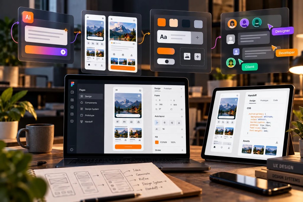
UI/UX + Figma
By now, Figma should feel less like a collection of tools and more like an environment where your UI/UX decisions become visible.
That distinction matters. Learning Figma is useful, but UI/UX design is not simply about creating polished screens.
A complete workflow connects:
- User understanding: Identify the problem before opening a blank Figma file.
- Structure: Use research and information hierarchy to decide what the interface needs.
- Wireframing: Explore the structure before investing heavily in visual details.
- UI design: Use typography, colour, spacing, components, and layout to communicate clearly.
- Prototyping: Demonstrate how users move through the experience.
- Iteration: Review the design, identify problems, and improve the solution.
- Communication: Explain the reasoning behind your design decisions.
This is the point where a Figma beginner guide tutorial should connect back to the larger discipline. Figma helps you execute and communicate design decisions, but it does not make those decisions for you.
UI UX Growth Lab’s article How to Learn UI/UX Design From Scratch by Thinking Like a User explores why beginners should develop design thinking instead of simply collecting tools and tutorials.
That becomes particularly important when preparing for professional opportunities. The article Learn UI/UX Design Google: Why Your Portfolio Isn’t Getting Interview Calls explains why completing tutorials alone does not demonstrate your ability to solve problems and communicate your decisions.
So, think of Figma as part of the process—not the entire process.
The next step is to put these skills into practice through real projects, where every tool has a reason to exist.
Practice Projects
Learning Figma becomes much more meaningful when you stop practising isolated features and start building complete projects.
A project gives every tool a purpose. Instead of learning Auto Layout because it is on a feature list, you use it because your card needs to adapt. Instead of learning prototyping as another feature, you use it because your screen needs to demonstrate a user flow.
As you progress through this Figma beginner guide tutorial, gradually increase the complexity of your projects:
- Project 1 — Landing page: Practise frames, typography, spacing, colour, images, and basic layout.
- Project 2 — Mobile app: Apply components, Auto Layout, navigation, and responsive thinking.
- Project 3 — Dashboard: Work with repeated patterns, information hierarchy, tables, cards, and reusable components.
- Project 4 — Complete product flow: Combine wireframes, UI design, components, prototyping, and interaction states.
- Project 5 — Portfolio project: Document the problem, process, decisions, iterations, final UI, and prototype.
The important part is not the number of projects. Each project should teach you something new.
UI UX Growth Lab’s Beginner UI/UX Training follows a project-based structure that includes three guided projects across website and mobile design, alongside Figma, wireframing, prototyping, portfolio development, and mentor feedback.
Once your foundation is stronger, the Advanced UI/UX Training can become the next stage for developing more advanced, industry-oriented project skills.
For additional practice resources, the Ultimate UI/UX Kit includes wireframes, reusable UI cards, website components, design resources, AI UX practice prompts, and case-study templates.
Your projects are not just exercises. They become the evidence of what you can think, design, improve, and communicate.
Progress Assessment
Learning Figma is not about counting how many features you know. A better measure is whether you can use those skills independently to solve and communicate a design problem.
Use this checklist as you progress:
- Can you create a complete screen without following every tutorial?
- Can you explain why you chose a particular layout or interaction?
- Can you use Auto Layout and Components appropriately?
- Can you adapt your design for different screen sizes?
- Can you build and test a basic prototype?
- Can you identify weaknesses and improve your design?
- Can you explain your decisions clearly to someone else?
This Figma beginner guide tutorial should ultimately help you move from “I know Figma” to “I can use Figma as part of a thoughtful UI/UX process.”
Your portfolio should demonstrate that progression. UI UX Growth Lab’s How to Build a Design Portfolio That Gets Google’s Attention encourages designers to show how they respond to ambiguity, constraints, changing requirements, and increasingly complex problems.
Similarly, Learn UI UX Design Google: Why Recruiters Reject Your Portfolio highlights the importance of original projects, design decisions, iterations, and complete case studies rather than simply displaying polished screens.
For personalised guidance, you can also explore Bidisha Sen’s mentor page, which explains her approach to helping aspiring designers develop practical skills, portfolios, and design thinking.
The next step is to turn your strongest projects into work you can confidently present on Behance and LinkedIn.

Behance + LinkedIn
You have learned the tools, built projects, tested your designs, and reviewed your progress. Now it is time to show your work where people can actually see it.
Your Behance and LinkedIn presence should not simply display attractive Figma screens. They should communicate how you think as a designer.
On Behance
- Present complete case studies rather than isolated screens.
- Explain the problem, process, decisions, iterations, and final outcome.
- Include wireframes, prototypes, and relevant design explorations.
- Keep the presentation clean and easy to follow.
- Show different types of projects instead of repeating the same interface.
You can also study how experienced designers present their work. For example, Bidisha Bhowmick Sen’s Behance profile includes website designs, mobile app interfaces, dashboards, and UX case studies.
On LinkedIn
- Share selected projects and design learnings.
- Explain the reasoning behind your design decisions.
- Document your progress instead of posting only finished screens.
- Connect your portfolio to your professional profile.
- Keep your project descriptions clear and relevant to the roles you want to explore.
You can also explore Bidisha Sen’s LinkedIn profile, which showcases UI/UX experience, projects, certifications, and professional work.
A Figma beginner guide tutorial can teach you how to create the work, but your portfolio should demonstrate what you can do with those skills.
If you need help identifying what to improve, UI UX Growth Lab’s mentor profile explains its approach to practical feedback, portfolio development, and design thinking.
The UI/UX Design Training: The Truth About Mentorship article also explains how effective mentorship can help learners identify weaknesses, understand why they matter, and apply those lessons independently.
Your portfolio is where your Figma skills become evidence of your design process.
Figma and UI/UX Statistics You Should Know
Figma is no longer limited to a small group of interface designers. Its growing role across design, development, product management, and AI-assisted workflows shows why learning the platform can be valuable for aspiring UI/UX designers.
Here are a few statistics that put that growth into perspective:
85% of Figma users were based outside the United States as of Q1 2025, highlighting the platform’s global adoption.
Approximately two-thirds of Figma’s monthly active users were non-designers in the three months ending December 2025, showing how Figma increasingly connects designers with developers, product managers, researchers, marketers, and other teams.
More than 40% of BSE100 companies used Figma as of September 2025, according to Figma’s India research.
Figma reported that designers using a relevant design system in one experiment completed their objective 34% faster than those without one.
Figma’s 2025 AI research surveyed 2,500 users, with one in three respondents reporting that they were launching AI-powered products that year.
Figma Make’s weekly active users grew by more than 70% quarter-over-quarter in Q4 2025, according to Figma’s financial results.
These numbers reinforce an important point for beginners: learning Figma is not simply about learning how to create attractive screens. Modern Figma workflows increasingly involve systems, collaboration, prototyping, development, and AI-assisted product creation.
That is why learning the features in the right order matters more than trying to learn everything at once.
People Also Search For
Yes. Figma is relatively approachable for beginners when you learn its core tools first and gradually move into Auto Layout, Components, prototyping, and responsive design.
Start with the workspace, frames, shapes, text, images, alignment, and basic properties. Then progress to Auto Layout, Components, responsive design, and prototyping.
The timeline depends on your previous design experience and how consistently you practise. Learning the basics can be relatively quick, while becoming comfortable with advanced workflows requires continued project-based practice.
Yes. You can learn Figma without prior UI/UX experience, but understanding layout, typography, hierarchy, usability, and user flows will help you use the tool more effectively.
Beginners should start with Frames, Shapes, Text, Images, Pen, Alignment, Fill, Stroke, and basic layout controls before moving into more advanced features.
Yes, learning Auto Layout first can make Components easier to understand because you will already know how elements can respond to content and spacing changes.
Figma is an important design tool, but UI/UX design involves much more than software skills. You also need to develop research, problem-solving, information architecture, interaction design, visual design, prototyping, and communication skills.
Figma Make can be explored after learning the fundamentals. Understanding design principles first helps you evaluate and refine AI-assisted outputs rather than relying on them without review.
Start with simple projects such as a landing page, login screen, mobile app screen, dashboard, or website. Gradually move toward complete UI/UX projects and case studies.
Yes. Strong projects can become portfolio case studies when they show the problem, process, design decisions, iterations, final UI, and prototype—not just polished screenshots.

Frequently Asked Questions (FAQs)
Start with the Figma workspace and essential tools, including frames, shapes, text, images, alignment, and basic properties. A structured figma tool tutorial can help you understand these fundamentals before moving into Auto Layout, Components, responsive design, and prototyping.
Follow a structured learning sequence instead of trying to learn every feature at once. A good Figma beginner guide tutorial should take you from workspace fundamentals to UI design, Auto Layout, Components, prototyping, and real projects, with practical exercises between each stage.
Figma guidelines help you maintain consistency across spacing, typography, colour, alignment, hierarchy, and reusable interface elements. Following clear guidelines makes your designs easier to understand, maintain, and scale as your projects become more complex.
Figma Make can be explored after you understand the fundamentals of UI/UX design and Figma. figma make tutorials can help you experiment with AI-assisted workflows, but generated results should still be reviewed using your understanding of layout, hierarchy, responsiveness, and usability.
Learn basic prototyping before moving into motion. Once you understand how interactions work, a figma motion tutorial can help you explore transitions, micro-interactions, and animated states. Motion should support the user experience rather than simply decorate the interface.
Conclusion
Free Doesn’t Mean Bad, But Free Doesn’t Mean Complete
The value of ui ux courses free with certificate isn’t that they automatically turn a beginner into a professional designer.
Their value can be much simpler:
- They open the door
- They introduce the field
- They build foundational knowledge
- They provide opportunities to practise
- They help you decide where to go next
As your goals develop, your learning requirements may develop too.
You may move from:
Exploring → Understanding → Practising → Building → Refining → Demonstrating
If you reach the point where you want a structured path connecting UI/UX concepts, practical projects, Figma, design systems, prototyping and portfolio development, explore What You Will Learn at UI UX Growth Lab.
Free learning can be valuable.
Structured learning can be valuable too.
The important thing is understanding what you need from your learning at each stage.
Free doesn’t mean bad. It simply doesn’t mean complete.
Stop Watching Tutorials. Start Designing for Real.
No coding. No confusing theory. Just practical UI UX skills, real projects, portfolio building, and mentorship that helps beginners become industry-ready designers.


Bidisha Sen
https://uiuxgrowthlab.comI’m a Lead UI/UX Designer and mentor with 3.5+ years of experience in UI/UX design. I transitioned into design after spending 5 years in IT business development, progressing from Business Development Executive to Senior Business Development Executive. Today, I combine my understanding of business, users, and design to help aspiring designers build practical skills and industry-ready portfolios.